

What is a landing page? Definition
Wondering what a landing page is? We’ll explain everything to you!
A landing page is like the showcase of your offer.
This is THE page where your visitors land after clicking on an ad or a specific link. Its goal? To convert these visitors into customers or leads.
Characteristics of an effective landing page
So what makes a good landing page?
- A clear and concise message: No unnecessary blah blah here!
- An eye-catching call to action ( CTA ): Want your visitor to click? Make it obvious!
- Impactful visuals: A picture is worth a thousand words, right?
- Social proof: Nothing like testimonials to reassure your future customers.
- A well thought out form: Ask only for the information you really need.
You see, an effective landing page is a bit like a well-oiled conversion funnel. It guides your visitor towards the action you want them to take.
Landing page vs classic web page
You might be thinking, “But how is this different from a regular web page?” Good question!
A typical web page is like an all-you-can-eat buffet. It offers lots of options and information.
👉 A landing page is more of a tasting menu: focused on one thing.
Here are the main differences:
Navigation: Minimal on a landing page, complete on a classic web page.
Purpose: Single for a landing page, multiple for a web page.
Content: Targeted and concise on a landing page, more general and detailed on a web page.
Links: Few or no outgoing links on a landing page, unlike a classic web page.
The different types of landing pages
Did you think there was only one type of landing page? Think again!
There are several of them, each with its own objective:
Sales page: It aims to make you buy a product or service.
Lead capture page: Its purpose? To collect your contact information in exchange for a free offer.
Click page: It pushes you to click to go to another page ( often used in affiliation ).
Each type of landing page has its own tips and best practices.
Your goal? Choose the one that best fits your marketing objective.
How to create a landing page?
Now that you know what a landing page is, let’s take action!
Want to create a landing page that really converts? We’ll show you how, step by step.
Define the objective and target audience
Before you dive in head first, ask yourself these questions:
- What is your goal?
- Who do you want to reach?
Your goal may be to:
- Sell a product
- Generate leads
- Register for a webinar
- Promote an event
And your target audience? Who exactly is it?
- Marketing pros?
- Are you passionate about cooking?
- Die-hard gamers?
The more you know your audience, the more effective your landing page will be.
Steps to designing an effective landing page
- Define your goal and audience
- Create an eye-catching message
- Design a clear structure
- Choose impactful visuals
- Write compelling content
- Adds social proof elements
- Integrate a powerful form or CTA
- Optimized for mobile
- Test and improve
Does that seem like a lot to you? Don’t panic, we’ll break it all down!
Structuring the content
Your landing page is like a good recipe. It needs the right ingredients, in the right order.
Here is a structure that has proven itself:
- Catchy Headline
- Explanatory subtitle
- Main advantages
- Detailed explanation of the offer
- Testimonials or social proof
- Main CTA
- FAQ (if necessary)
👉 Remember: every element should push your visitor towards the action you want them to take. Copywriting can help you achieve this.
Optimizing design for conversion
Design isn’t just about looking pretty. It’s a real conversion booster!
Some tips:
- Use contrasting colors for your CTA
- Keep plenty of white space for easy reading
- Choose readable fonts
- Use icons to illustrate your key points
Want to know if your design works?
👉 Take the squint test: squint your eyes while looking at your page.
Does the most important element emerge?
Incorporate impactful calls to action (CTAs)
Some tips for a CTA that converts:
Be specific: “Get my free ebook” instead of “Click here”
Creates a sense of urgency: “Offer limited to 24 hours”
Use the first person: “I want my guide” instead of “Download the guide”
Landing page creation tools
Not a coding pro? No worries!
There are plenty of tools to create landing pages easily:
- Leadpages : Super easy to use
- IO System : Perfect for A/B testing
- ClickFunnels : Excellent for creating complete sales funnels
Choose the tool that best suits your needs and technical level.
Embedding videos to boost conversions
A video on your landing page is like a turbo for your conversions!
It can increase your conversion rate by up to 80%!
Some video ideas:
- Product demonstration
- Customer Testimonials
- Explanations of your offer
Remember to keep your videos short and sweet. Attention is like money: you have to earn it!
Mobile Optimization
Today, if your landing page is not optimized for mobile, it’s like you’re closing the door to half of your visitors. Do you want that? No, of course not!
Here’s how to optimize for mobile:
- Responsive design
- Buttons large enough for fingers
- Short forms
- Concise content
Test your page on different devices. It should look and function as well on a smartphone as it does on a computer.
Examples of landing pages that convert
And if you want to know more, check out our full article which presents a multitude of landing page examples .

Netflix
Netflix’s landing page is a model of conversion efficiency.
The title “Unlimited movies and series, and much more” immediately captures attention.
The clean design highlights the visual content.
The bright red “Get Started” button stands out perfectly.
The key benefits are clearly presented:
- multi-device availability,
- offline access,
- child profiles.
The FAQ at the bottom of the page builds confidence.
The promotional offer acts as a powerful conversion element.
This page demonstrates a detailed understanding of the customer journey and digital marketing techniques.

Shopify
Shopify takes a straightforward approach with its title “Build Your Online Store with Shopify.”
The 3-day free trial offer is highlighted, with a simple sign-up form.
Visuals reinforce the message of success.
Logos of well-known brands serve as social proof.
The page details the key benefits :
- ease of use,
- integrated marketing tools,
- 24/7 support.
This landing page is designed to encourage immediate action while reassuring potential users.
Dropbox
Dropbox stands out for its minimalist approach.
The soft color palette and clean typography create an atmosphere of calm and organization.
The key message is concise : “Keep your files organized, up to date and protected.” This simplicity reflects the essence of the service.
However, the lack of customer testimonials or feature comparisons is notable.
Dropbox appears to be relying on the strength of its brand and reputation to convince, rather than an abundance of information.
Landing page optimization
You’ve chosen your creation tool, that’s great! But don’t think the work stops there.
Optimizing your landing page is like training an athlete: it’s an ongoing process.
Improve loading speed
Do you know how long a visitor waits before leaving a page that loads too slowly? 3 seconds!
Yes, you read that right. That’s how long it takes you to say “ landing page .”
So how do you speed up your page?
Compress your images. Use tools like TinyPNG to reduce their size without losing quality.
Minify your code. Remove spaces, comments, and unnecessary characters from your CSS and JavaScript.
Use a CDN ( Content Delivery Network ) . This allows you to distribute your content from servers closer to your visitors.
Reduce distractions
Your landing page is like a GPS. It should guide your visitor to a single destination: your CTA.
Everything else? Potential distractions.
Remove the navigation bar. Your visitor doesn’t need to visit the rest of your site.
Limit external links. Every link is a potential exit.
Focus on one goal. One offer = one landing page.
Use impactful visual elements
They say a picture is worth a thousand words. On a landing page, it can be worth a thousand conversions! Visuals are essential to capture attention and convince.
Use photos of real people. It creates trust and empathy.
Show your product in action. A demonstration is worth more than a long description.
Add icons. They make information more digestible and memorable.
Advanced Strategies for Landing Pages
A/B testing: methodology and best practices
A/B testing is like being a marketing scientist.
You create two versions of your landing page and see which one performs better. Simple, right?
Here’s how to do it:
- Choose an element to test: title, CTA, colors, images…
- Create two versions of your page, identical except for this element.
- Drive half of your traffic to each version.
- Analyze the results after reaching a significant sample.
Only test one thing at a time. Otherwise, it’s like trying to watch two games at the same time: you won’t know what really made the difference.
Dynamic content personalization
Imagine a landing page that adapts to each visitor. It’s possible with dynamic personalization!
You can adjust your content based on:
- The visitor’s location
- His browsing history
- The traffic source
For example, if someone comes from a vegan recipe site, show them a version of your page that focuses on plant-based ingredients.
Integration with marketing campaigns
Your landing page doesn’t live on a desert island. It’s part of a larger marketing ecosystem.
How to integrate it effectively?
👉 Make sure your landing page message matches your ads. If your ad is about magical unicorns, your landing page should be about them too!
👉 Use the same language and tone as you do in your emails or social media posts. It’s like wearing the same t-shirt to every concert of your favorite band: it creates consistency.
👉 Include social proof elements related to your campaign. Customer testimonials? Mentions of awards won? Show them off!
👉 Don’t forget post-conversion follow-up. A personalized thank you page or welcome email can make all the difference.
Performance analysis and measurement
You’ve optimized your landing page, but how do you know if your efforts are really paying off?
This is where performance analysis and measurement come into play.
Essential KPIs for landing pages
Imagine that your landing page is a video game. The KPIs (Key Performance Indicators) are your life points, your score, your level. They tell you if you win or lose.
👉 Conversion rate is your final boss. It’s THE number that tells you how many visitors took the action you wanted.
Are you selling fun socks? Your conversion rate tells you how many people bought them.
But that’s not the only KPI to monitor.
👉 Bounce rate is like the number of players who leave the game before even starting.
If it’s high, something is wrong with your page.
👉 Time spent on the page is a bit like playing time.
The longer people stay, the more interested they are. But be careful, if they stay too long without converting, it may be because your CTA is not clear enough.
Analysis tools for landing pages
Now, how do you get all these numbers? You have several options, each with its advantages.
👉 Google Analytics is the Swiss army knife of web analysis.
It gives you an overview of your performance. You can see:
- where do your visitors come from,
- how long they stay,
- and lots of other useful information.
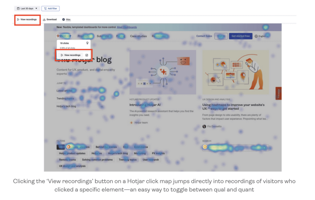
👉 Hotjar is like having surveillance cameras on your page. It shows you:
- where people click,
- how far they scroll.
You can even see session recordings. It’s a little creepy, but super useful!
Comparison of the main creation tools
Are you ready to create your landing page but don’t know which tool to choose?
Don’t panic, we’re going to compare the main creation tools to help you make the right choice.
Leadpages: Features and Pricing
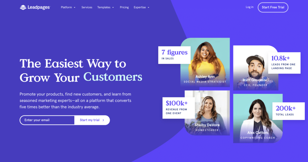
Leadpages is like the Swiss Army knife of landing pages. Want a page that converts without having to worry about the code? This is for you!
When it comes to features, Leadpages doesn’t mess around. You have:
- templates,
- a drag-and-drop editor,
- a tool for creating pop-ups and notification bars.
It’s like having a personal marketing assistant!
For pricing, it starts at $37 per month if you pay annually.
It’s the price of a good meal at a restaurant, except that here, it’s your business that you’re feeding!
Systeme.io: advantages and disadvantages
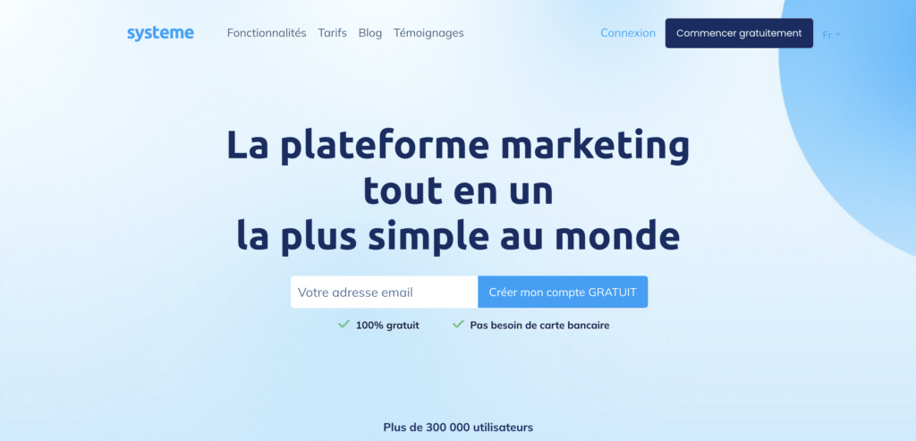
Are you looking for an all-in-one solution for your online business? Systeme.io might be your best choice!
The main advantage of Systeme.io is that it doesn’t just make landing pages. You can manage:
- your landing pages,
- member areas,
- your emails,
- your webinars,
- your affiliate programs…
But be careful, all-in-one sometimes means less specialization. If you are looking for ultra-specific features for your landing pages, you might be a little limited.
ClickFunnels: for whom and why

ClickFunnels is the oldest landing page tool.
ClickFunnels shines with its ability to create sequences of interconnected pages.
You can guide your visitor from the landing page to the sales page, then to the confirmation page, all in a seamless manner.
Pricing wise? It starts at $97 per month. Yes, it’s steep. But if you’re serious about your online business, it can be worth every penny.
What you need to remember
- Create a clear and impactful value proposition right from the title of your landing page.
- Opt for a clean design that guides the visitor’s attention to the essential elements.
- Place a visible and enticing call-to-action (CTA) above the fold.
- Highlight the key benefits of your product or service in a concise manner.
- Use social proof like customer testimonials or well-known brand logos.
- Integrate relevant visuals that illustrate your offer or user experience.
- Simplify the registration form to reduce barriers to entry.
- Offer a free trial or demo to encourage engagement.
- Target your message to meet the specific needs of your audience.
- Add interactive elements like calculators or videos to engage the visitor.
- Structure your page in a way that naturally guides the visitor towards conversion.
- Anticipate and respond to potential user objections.
- Ensure consistency between your message, your design and your brand.
- Optimize your page for different devices with responsive design.
- Eliminate distracting elements like complex navigation menus.
